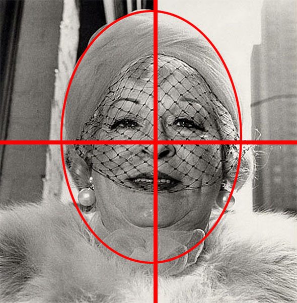
Symmetry in 6×6 photo by Diane Arbus
You can see all my composition lessons here.
I have been quite fascinated with the square-format in street photography for a while. My fascination first came about from Jeroen Helmink, a photographer from the Netherlands (you can see a fun video we made on shooting Hasseblads).
There was something quite sexy about the 6×6 format– the way that it
created perfect balance in the frame, the simplicity, as well as the
novelty.
Of course as Instagram has become insanely popular– the square-format
just looks like an “Instagram shot.” I have heard of Instagram as
“ruining” the 6×6 format (medium-format film).
However I don’t think it really matters what camera, format, or
aspect ratio you shoot in. Ultimately the most important thing is to
create a visually compelling image that speaks to our hearts or souls.
I’ve personally been shooting a lot of square-format images on my smartphone (and uploading them to my Instagram).
In-fact, I prefer to shoot with the Instagram application, generally
use the “Amaro” filter”, turning my phone to airplane mode (so I don’t
need to immediately upload the images), and then save them to my phone
(before uploading the images).
I’ve found shooting the square format to be quite fun. There is a
novelty to seeing the world in a square-crop, as we generally see the
world in a landscape format.
I don’t know what makes the square crop so appealing to many– but I
know what I personally like about it. I’m going to use this post as a
chance to explore some of my favorite square-format images in street
photography, and perhaps offer practical tips to better utilize it in
street photography.
Lee Friedlander
Lee Friedlander is one of my favorite street photographers of
all-time. I love his wry sense of humor, the melancholy and simplicity
in his shots, as well as his strong compositions. I’ve previously
written a lengthy article on him here.
Friedlander has shot different formats in his lifetime, mostly on his
Leica (35mm film) and on his Hasselblad Super Wide (6×6 medium-format
film).
For this section, I will examine some of my favorite 6×6 photos of
his, and explain why I personally like them (and what I think works):
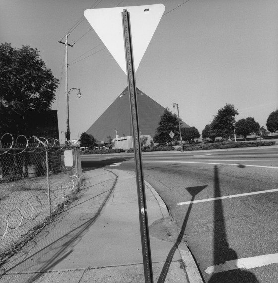
Lee Friedlander / Memphis, 2003

Lee Friedlander / Memphis, 2003
This is a photograph Friedlander took in Memphis in 2013, part of his “Sticks & Stones” project.
Friedlander shoots a lot of urban landscapes– photographs of the urban environment (mostly without people, focusing on strong compositions, and visual elements).
One thing I first admire about the shot is how he fills the frame.
Almost every part of the frame is filled. The top-left corner you
have leading lines from the telephone wire connecting to the triangular
sign on the top of the frame. The bottom-left corner, you have leading
lines from the barbed-wire fence, coming into the center of the frame.
And on the bottom-right corner, you have the shadow of the sign, shadow
of a light post, and a slight outline of Friedlander’s own self-portrait.
The only thing that probably doesn’t work is the top-right corner
(which is a bit empty– wish it had a plane, birds, or something else):

What makes the photograph really great, is the triangular-shaped
building in the middle of the frame– which looks like a mirror version
of the triangular sign on top of the frame:

Also the lines from the telephone pole in the top-left of the frame
are quite superb– as they look like they connect with the triangular
post on top– flattening the perspective of the image:

I also like the curved, leading lines that give the image a nice sense of motion:

Ultimately what I feel makes this square-format work is the fact that he filled the frame, he had strong geometric elements (triangles, straight-lines, curves), and the sense of balance in the shot.
Lee Friedlander / Nebraska, 1999 / America By Car Portfolio

In this photograph by Friedlander in his “America by Car” series– I love the idea of the surrealism in this photograph.
For his entire “America by Car” series– Friedlander shot photographs
from inside his car– looking out. You can see in some of the shots, he
used a flash to balance the light inside of the car to the background
environment. The effect this creates is that it creates more dynamic
range in the shot, and also a sense of surrealism (what is inside, and
what is outside?)
What makes this shot interesting is that you have a herd of bison,
cattle, cows, sheep, (not sure what kind of animals they are) — with the
car’s tinted window slightly hovering below them. Friedlander plays
with a sense of scale here (the herd of animals almost
looks like they can fit on top of his car window). But we know in
reality, the cattle are really far away.
What I think makes this shot work as a square crop is that the
squares and rectangles in this photograph repeat themselves. You have a frame-in-a-frame:

Not only that, but you also have some other rectangles in the shot which add to the image:

I also love the little bit of white-space between the herd of animals
and the car window, which gives it a good sense of separation and figure-to-ground:

Note the two elements in the shot (the herd and the car window).

The blue outlines the separation between the two elements in the frame.
And of course, we also have some nice curves in the shot — from the
various car handles and door– which makes the shot more dynamic:

Ultimately what I love about the shot is once again, the sense of surrealism, his strong framing
(which is made even stronger with the square-format), as well as the
use of curves (juxtaposed against the squares/rectangles in the shot).
Consistency with the 1:1 (Square) Format
As a side-note, I feel that if you want to shoot with a square-crop in your photos, you should go out with the intention of only shooting a square format in mind.
For example, if you’re shooting with a Hasselblad, Rolleiflex, or any 6×6 medium format camera– you’re restricted to only shooting square-format shots.
I think a mistake a lot of photographers do is go out and shoot RAW
digitally (in a 3:2 aspect ratio), then decide to crop the photos to a
square afterwards.
It is quite easy to do this with digital cameras– just go to the menu
of your camera, and choose to shoot RAW+Jpeg, and choose the 1:1 aspect
ratio. The RAW+Jpeg setting in a lot of cameras unlocks the “1:1″
aspect ratio feature.
Mike Peters
Another great contemporary street photographer is Mike Peters, who has done a lot of 6×6 work with his Hasselblad. He has created a strong body of work of street portraits.
You can see more of his work in his “The Dream” series.
Mike Peters / Coney Island / 2010

Gabrielle and John with Charlie McCarthy / Mike Peters
This image is one of my favorites by Mike Peters. He shares the story of the image on Flickr:
Some may wonder about Charlie, I know I did. I
was on the pier when I first saw Gabrielle in the surf with Charlie
sitting on his little red chair which you can see a bit of off on the
right. I went down to the beach where I found Gabrielle was now with
John and Charlie. We talked for a bit, shared a bit of rum and I shot
some photos. They just brought him on a lark, and I’m still not sure
why, but I’m glad they did!
What instantly attracts me to the shot is the
sense of surprise I get from the shot– an attractive couple on the
beach, the intimate distance, and randomly– a creepy puppet on the
bottom?
In terms of the composition, I first love the
triangle composition
that Mike Peters created with the two couple and the dummy on the
bottom. There is a nice balance of subjects — having 3 of them
(generally multiple-subjects best work in 3′s):
Not only that, but I love the different body
gestures in the shot. You have the woman in the top of the frame looking
to the bottom right (while grasping the dummy with her hand and also
having her arm on her head), the man stretched out– with his arm going
to the bottom-right of the frame and looking to the left of the frame,
and then finally the little dummy with his arm in a diagonal, legs
crossed, and looking to the left of the frame too:
The couple is quite sexy too– with the woman and her busty chest, and the man with his suave chest-hair.
There is also a nice balance of colors in the
shot– with the blue on top of the frame juxtaposed against the red
tones in the bottom of the frame:
Ultimately what makes the shot strong is the content (what
is going on in the frame). You have interesting gazes from both the
woman and the man. The woman looks sexy with her busty chest,
indiscriminate gaze, and her arm around her head. The man has a slight
smirk on his face, looking away– in a quite content sort of way, with
his well-aged grey hair against his grey chest-hair. And of course, the cherry-on-top (best detail) is the creepy dummy with a creepy smile, looking as if he is relaxing on the beach (and a child of the couple):
Now you might be asking yourself– Did Mike (or Lee Friedlander) or any of these photographers in this article intend
to do all of this? I think some of it was intentional, some of it was
intuitive, and some of it just happened. I’m just post-dictating what I
like about the shots, regardless of the intent of the photos.
I don’t think we should discredit any parts of photos because they were done on “accident”. If they work, they work.
Mike Peters / Brighton Beach, NY
In this photograph Mike Peters masterfully utilizes the 6×6 aspect ratio in the image.
First of all, the square of the format
perfectly juxtaposes the circular nature of her head, glasses, and the
triangular shape of her mouth and nose:
Not only that, but Mike left a crucial amount of negative space above the woman’s head:

Negative space above the woman’s head outlined in blue.
Also the colors have perfect harmony in the shot (in terms of color theory)–
with the mostly neutral colored background, and the woman’s
cool-colored headscarf (green, blue, turquoise) juxtaposed against her
bright-red lips:
If we blur the image (using the “gaussian blur” tool in Photoshop), you can see the tones of the images easier:

Here you can see the outlines of the cool versus warm colors:

There are also quite strong horizontal lines in the shot which point to the woman:

Furthermore, the shot has good good separation between the woman and
the background, because the background is quite clean, and Mike shot
this a little more wide-open.
How did Mike take the shot? He chatted with her for a bit. He explains on Flickr.
Question: Did you tell her something nice, before or after taking the photo?
Mike Peters: We talked about how she used to sell cameras many years ago. She never heard of a Hasselblad though.
I think we can learn from this little excerpt that if you find a great subject in the streets– don’t feel that you only have to take candid shots. Don’t be afraid to ask for permission. If you are afraid to take photos of strangers in public, you can download my free e-book: “31 Days to Conquer Your Fear of Shooting Street Photography.”
Anyways ultimately I connect with the woman — I love her vibrant colors, her whimsical look, and stylish look in her old age.
Diane Arbus
Of course, we can’t talk about 6×6 photos without mentioning Diane Arbus. Diane Arbus also shot a lot of 6×6 black and white images with her Rolleiflex and flash, mostly of street portraits.
This image by Diane Arbus below reminds me of Mike Peters’ shot
above– except Arbus got slightly closer, shot with a flash, shot from a
slightly lower angle, and shot the image more symmetrically:
Diane Arbus / Lady with Earrings

Immediately what works in the shot is the flash gives a good
separation of the woman from the background. I love her glazed look, and
the little black net over her face.
Furthermore, what is immediately apparent is the abundance of circles in the shot (juxtaposed against the square-crop of the image):

Furthermore, the sense of symmetry is superb– which makes the 6×6 shot work wonderfully:

I also like how Arbus filled the frame quite well with this woman,
with the fur of the woman’s chest going to the bottom of the frame– and
the building in the top-right. The top-left overlaps a little with the
woman’s head, but the shot is still strong:

Diane Arbus – Circles
In a similar image– Diane Arbus takes a close-cropped photo of a woman, who is also abundant with circles in the shot:

Diane Arbus – Symmetry in Twins
So as a side-note, I feel some of the best square photos work when there is a juxtaposition between the square and circles in the frame.
I also feel that having symmetry is much more important in square photos, and helps it make a great photograph.
For example in this famous “twins” photo by Arbus, you see how the twins create strong symmetry in the shot:

What also works in the shot is that the twins look like clones– while
there is a juxtaposition of facial expressions in the girls. The girl
on the right looks happy, while the girl on the left looks like she is
tormented inside.
You can see how their shapes mirror each other:

Mike Peters / Triplets
Similarly in another of Mike Peters’ photos– you can see strong symmetry (in 3′s) in his photo below:

With the symmetry shown below:

Vivian Maier
In regards to how to shoot a street portrait, it seems to frame the subject relatively centered– with the eyes in the upper-third of the frame works well:
Here are some examples from Vivian Maier:


And as you can see, if you stack all these images on top of each other, they are all relatively framed the same:

In red below, I highlighted roughly how she positioned her subjects’ bodies:

And in blue, I outlined roughly where her subjects’ eyes fall:

When I put a “rule of thirds” grid over the image in Lightroom, it seems her images generally follow the grid:

Also it seems to fit the “diagonal grid” in Lightroom as well:

As a side note, to access the different overlays in Lightroom, go to
the “Develop” module on top (hotkey “D”), go into the crop tool (hotkey
“R”), and then change the overlay with the “O” hotkey. You can also press “Shift+O” to change the orientation of the overlays.
Something interesting I noted is that when you put the guidelines for
different crops on, you can see that there is an “ideal” amount of
negative space above her subjects’ heads. I have no idea the explanation
behind this– but I simply observed it and find it interesting.
I outlined the negative space above her subjects’ heads outlined in
purple, which follows the “4×5″ crop. Perhaps I’m finding some patterns
and being fooled by randomness? I have no idea- perhaps we can discuss this more in the comments section at the end of the post.

Also when you change the
crop overlay to the “
Golden Ratio“
, I
noticed that the image fit even better than the rule of thirds– with
the edges of the frame corresponding with the edges of the “eye area”
(outlined in blue):
Anyways, I think I’m getting a little distracted by all of this– let me go back to squares.
Shinya Arimoto – Street Portraits
Another great street photographer who shoots street portraits with a Hasselblad super wide is Shinya Arimoto
from Tokyo. He shoots mostly single-portrait shots of interesting
characters on the streets with a flash. Some of my favorite photos of
his:


Similar to Vivian Maier, most of his subjects are center focused with
their eyes in the upper-thirds of the frame (or more centered in the
frame).
Eric Kim – Instagrams from America
Below are some of my own examples shooting square-format images.
These are a part of my on-going “Instagrams from America” series. All
shot with my smartphone (the Galaxy S3, Note 2, and Galaxy S5):


Tips shooting square format images
Below are some quick tips when it comes to shooting square format images:
- Fill the frame
-
Juxtapose squares and circles in the frame
-
When shooting single-subjects, center them– and have their eyes in the upper-thirds of the frame
-
Integrate lines and geometry into your image
-
Make your images symmetrical
-
Shoot squares intentionally (don’t just crop your images to a square-crop afterwards in post-processing)
Conclusion
I am certainly not an expert when it comes to shooting square-format
images, but I find them absolutely fascinating. To study the work of
great photographers who shot square-format images, I recommend checking
out the work of these photographers:
Masters:
Contemporary:


